Chartreuse's Met Gala Triumph: The Controversial Hue That Defined the Red Carpet
An analysis of the emergence of chartreuse on the Met Gala red carpet and S/S 2026 runways. We explore how this bold shade influences trends and how to interpret it for your own wardrobe.
Chartreuse's Met Gala Triumph: The Controversial Hue That Defined the Red Carpet
The Unexpected Star of the Red Carpet
Every year, the Met Gala becomes a stage for the most impactful fashion statements, where designers and celebrities define future trends. This year, amidst cascades of tulle and the sparkle of diamonds, an unexpected and complex player emerged: chartreuse. This acidic, vibrant yellow-green hue became one of the evening's most talked-about signals.
But it's more than just a bright color. Its appearance at the year's premier fashion event is a signal from the industry's avant-garde. It speaks to a shift in mood, a readiness for risk, and a search for new forms of expression. Let's delve into what lies behind this bold choice and why it's so significant.
From Runway to Met Gala: The Trend's Context
Chartreuse's appearance on the red carpet was no accident. This color has been maturing on the runways of leading fashion houses for several seasons. In their Spring/Summer 2026 collections, brands like Dior, Loewe, and Alaïa actively used its variations to infuse their creations with energy and edge.
Designers employed this shade to break conventional norms, add drama to classic silhouettes, and challenge the traditional palette of evening wear. The Met Gala merely brought this behind-the-scenes dialogue to a global stage, confirming chartreuse's status as a key color reflecting the zeitgeist.
The Psychology of Chartreuse: A Color on the Edge
Chartreuse is a complex and polarizing color. Situated at the intersection of yellow and green, it's often perceived as artificial, almost neon. It's precisely this 'controversiality' that makes it such a powerful tool in the hands of designers. It doesn't aim to please everyone; it demands attention.
Choosing such a shade is always a conscious decision. It symbolizes confidence, nonconformity, and creative boldness. In a world where fashion increasingly speaks to self-expression, chartreuse becomes synonymous with individuality and a willingness to step beyond the conventional.
Adapting the Trend: The Energy of Color in Your Wardrobe
While a floor-length chartreuse gown might seem exclusively a red-carpet choice, the energy of this trend is easily adaptable for real life. It's not about literal replication, but about embracing the core idea: a bold, uncompromising color as the foundation of an outfit.
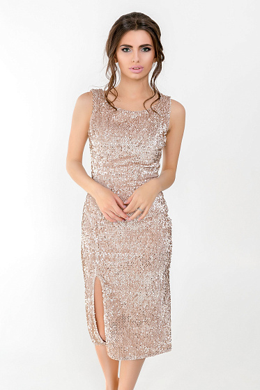
For instance, this piece demonstrates how a deep, vibrant color can single-handedly build an entire look, requiring only minimal accessories.
Similarly, metallic textures, such as gold, offer another interpretation of a striking appearance. See how this piece uses the shimmer and texture of velour to create a look that speaks for itself, reflecting the same principle of boldness as chartreuse at the Met Gala.
Silhouette as a Canvas for Color
Such a powerful color as chartreuse demands a carefully considered silhouette. Designers intuitively pair it either with extremely clean, minimalist lines, allowing the color to speak for itself, or, conversely, with architectural cuts that amplify the dramatic effect.
Exploring the Dresses, Jumpsuits collection can serve as a source of inspiration, demonstrating how various silhouettes address unique stylistic challenges and provide an ideal foundation for color experimentation.
FAQ
Is chartreuse truly suitable for everyone?
Like any complex color, it requires an individual approach. The key is to find your specific shade and the right dosage. You can start with accessories or choose an item where chartreuse is part of a print rather than the main color.
How do Met Gala trends influence everyday fashion?
The Met Gala sets the overall mood and direction. The boldest ideas from the red carpet are later transformed by designers into more wearable versions: colors become less intense, cuts become more practical. It's more a source of inspiration than a direct guide to action.
What colors best complement chartreuse?
For a subdued look, pair it with neutrals: black, white, deep gray, or beige. For a bold statement, try contrasting combinations with royal blue, purple, or even bright pink.
 Fashion's Bold New Vision: Why Statement Sunglasses Are This Season's Defining Accessory
From the runways of Paris to the streets of New York, exaggerated sunglasses have become a key signal for 2026. We delve into how a single accessor...
Fashion's Bold New Vision: Why Statement Sunglasses Are This Season's Defining Accessory
From the runways of Paris to the streets of New York, exaggerated sunglasses have become a key signal for 2026. We delve into how a single accessor...
 Eggplant Purple: The Unexpected Summer Hue Set to Define the Season
An editorial AZURI article about how t-shirts, tops, bodysuit, longsleeves translates the fashion news signal into wearable style.
Eggplant Purple: The Unexpected Summer Hue Set to Define the Season
An editorial AZURI article about how t-shirts, tops, bodysuit, longsleeves translates the fashion news signal into wearable style.
 Beyond Monochrome: Unexpected Color Duos That Will Define Summer 2026
Spring/Summer 2026 runways have declared an end to the era of restraint. Bold yet harmonious color combinations are replacing safe black and white....
Beyond Monochrome: Unexpected Color Duos That Will Define Summer 2026
Spring/Summer 2026 runways have declared an end to the era of restraint. Bold yet harmonious color combinations are replacing safe black and white....